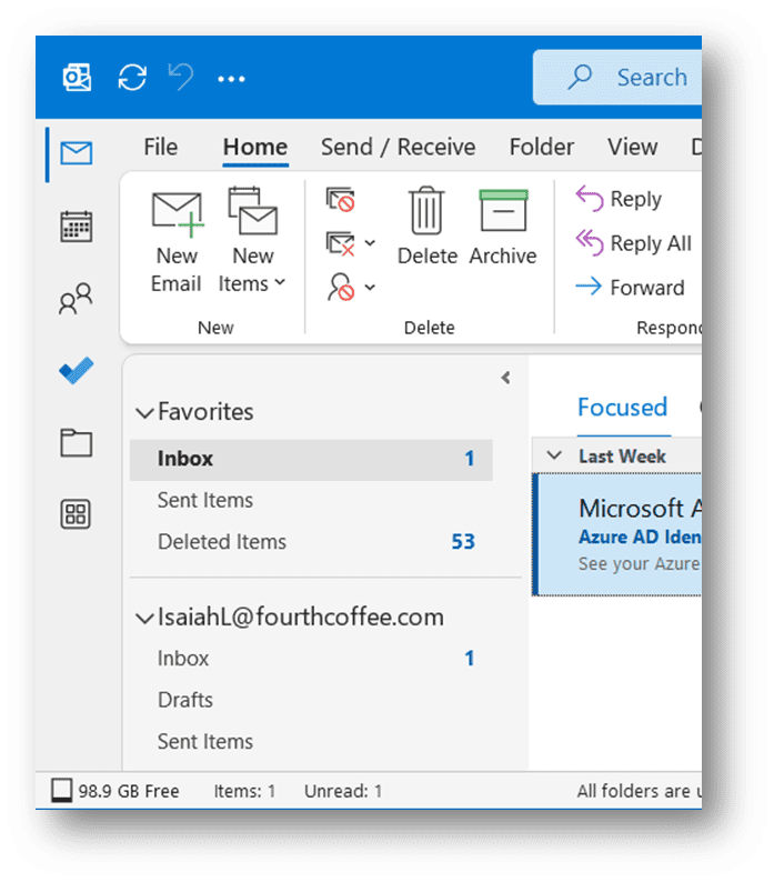
Microsoft wants to change the interface of the Outlook web app. Mail, Calendar, People, and To Do is currently located at the bottom of the dashboard. Soon the apps will appear on the left by default.
Microsoft Current Channel users have been able to test the update since March 2022. Until now, users had to enable the setting to view the new design. Microsoft ultimately wants to standardize the design.

new interface
Microsoft dropped in Technical community article Be aware that the change makes Outlook look similar to Teams and Office.com. In addition, the tech giant wants to provide more space for integrating applications with Outlook.
The ribbon allows you to open popular applications like To Do, Yammer, Bookings, Word, Excel, and PowerPoint without leaving Outlook. Other integrations are currently being developed and will be launched soon. Right-clicking on the ribbon allows users to pin favorite apps.
In addition to the visual change, the update includes new functionality. Thus, according to Microsoft, it is impossible to return to the old interface after the update.
Response
Not everyone is happy with this change. Terrygage, a member of the Microsoft Tech Community, called on the tech giant to find an alternative for users who don’t use third-party apps and “like the apps are at the bottom so the window makes more room for mail stuff.” Several users agreed, but Microsoft seems determined to go ahead with the update.

“Thinker. Coffeeaholic. Award-winning gamer. Web trailblazer. Pop culture scholar. Beer guru. Food specialist.”


More Stories
Comet Tsuchinshan-Atlas is ready to shine this fall
Sonos isn’t bringing back its old app after all
Indiana Jones and the Great Circle is coming to PS5 in spring 2025