As usual, Pantone predicts the color of the coming year. This says something not only about our taste, but also about what is happening in the world. The famous Color Institute says that the color of 2024 is about kindness and togetherness. Trend spotter Hilde Frank: “Pantone has completely succeeded in reflecting the zeitgeist with this color of the year.”
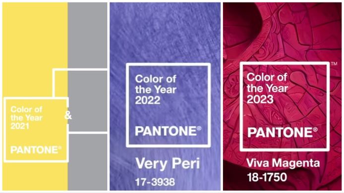
The shade chosen by the world-famous Color Institute each year says something not only about our aesthetic preferences, but also about the spirit of the times and social themes. For example, Pantone chose two colors exceptionally well in 2021: yellow and grey. Yellow symbolizes post-pandemic optimism, while gray symbolizes the sweatpants we’ve worn for a year. In 2022, the color is “Very Peri,” a kind of bluish-purple. Last year, “Viva Magenta” was the shade, a kind of cross between red, pink and purple.
2024: Longing for togetherness
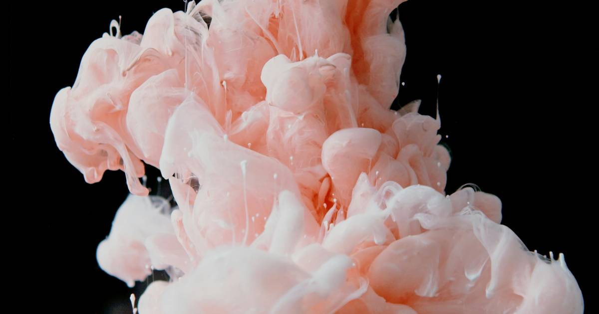
Pantone’s Color of the Year for 2024 is “Peach Fuzz”. Pantone describes it as “a warm, comforting shade that symbolizes our desire for togetherness and the feelings it brings.” It’s a new approach to a new kind of softness. A subtly sensual peach color that creates feelings of tenderness and communicates a message about caring, sharing, community and cooperation.
Furthermore, Pantone describes the color as delicate, velvety, contemporary and nourishing. Trend observer Hilda Frank: “Every year a color is chosen that reflects the trends and embodies the spirit of the times. This time they succeeded completely.”

Goodbye “millennial pink”?
Frank: “People have been saying for several seasons that coral is the new pink. It is a shade that is easy to blend and feels comfortable. One that is making a comeback in many themes, from interiors to clothing and accessories. Peach Fuzz is a pink shade with a soft orange undertone that belongs to the shades coral.
“The name is important and says a lot. If you translate it literally, you get ‘peach fuzz’. Pantone themselves describe it as velvety soft, like the skin of a peach. It is not only the color that is important, but also the texture. This refers to the importance of touch (Associating with the sense of touch, ed.) Presence or touch, a word that received a boost after the Corona crisis and continues to appear in various trend reports.
This is what the color of the year predicts as well
“Pantone gives importance Care and participation And cooperation To the color of the year. Collaboration, flexibility and sustainability will be the conditions of the future. “Not only between people but also in relation to clothing and furniture, for example.”
Frank adds that there is a reason colors are not named with symbols, but with specific words. “Peach Fuzz is not just a shade, but it also refers to texture and feeling. This way you see that there is a whole story behind one colour.
Read also:
Free unlimited access to Showbytes? Which can!
Log in or create an account and never miss a thing from the stars.

“Total coffee specialist. Hardcore reader. Incurable music scholar. Web guru. Freelance troublemaker. Problem solver. Travel trailblazer.”





More Stories
Bitcoin price rises after new jobs data from US
European stock markets open higher | beursduivel.be
Russia’s oil imports to China decline